
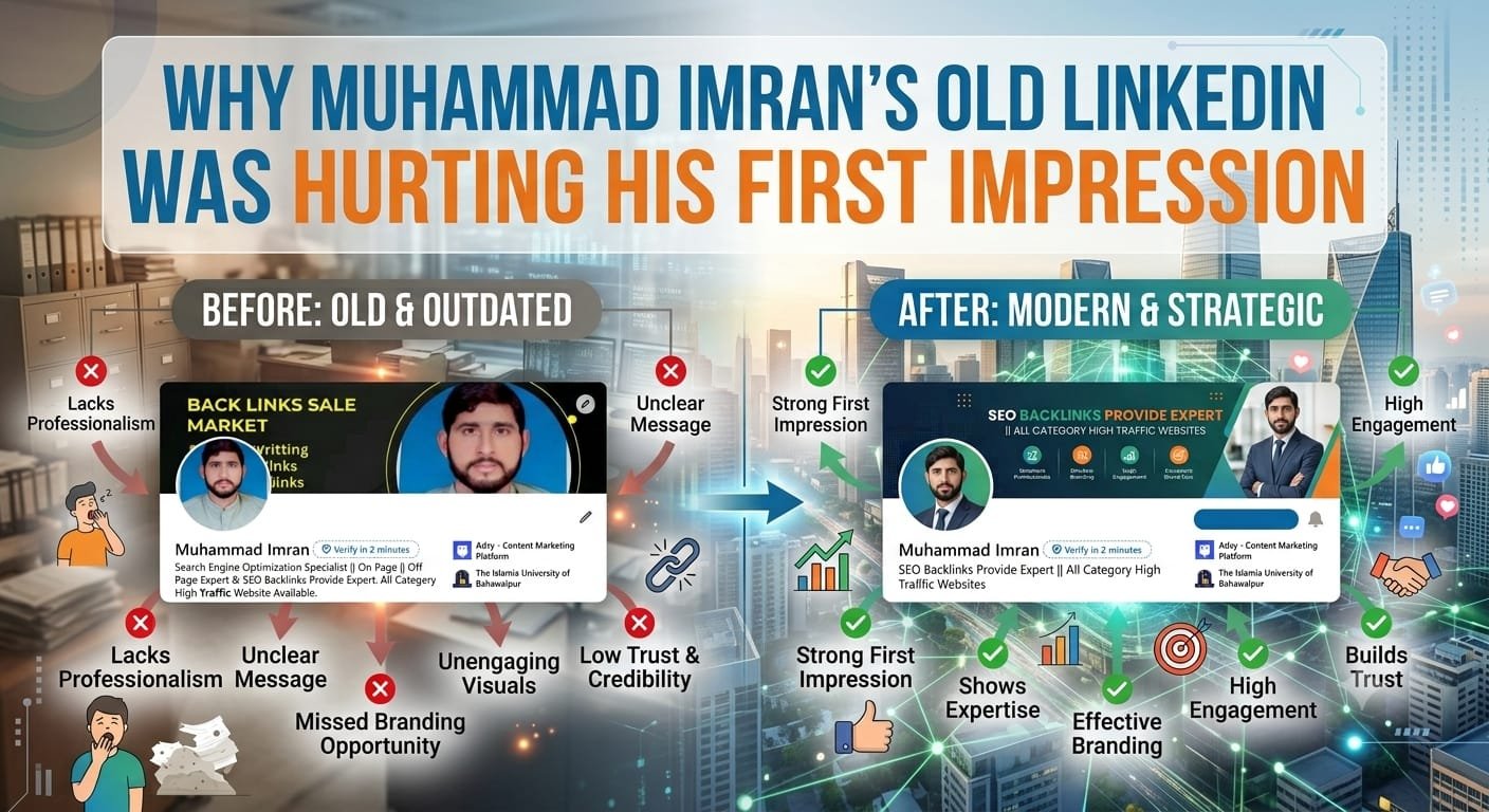
With the way business is done these days, your LinkedIn profile is likely to be your first impression on a prospective employer, client or partner. It’s the digital handshake that takes place before any talking. Most of the time, the things they have to work on and spend hours on is their profile picture, and their profile description. Now, some people don’t worry about the latter, but they do worry about the background photograph that is at the top of their profile. It is a most important mistake. If your LinkedIn banner is outdated or that it is generic or that it is not of a good quality, it can work against you, even before you start reading what you have written in your “Experience” section. With short attention spans, your banner must make a strong impression in order to create your brand.
The “Background” Bias
We’re all visual animals! Images are processed a thousand times faster than text. The top part of your profile is the first thing that people will look at when they visit your profile. If you’re using a photo that’s from a stock photo site from around 2008 or a picture of a city skyline that’s not related to your job, you are causing cognitive dissonance. You’ve got a modern and forward-thinking professional, but the evidence to the contrary is in the pictures.
The “ghost” of Jobs Past
Perhaps one of the biggest mistakes is to have a banner that relates to your current employer and job title. Previously the marketing director for a tech start-up and now a freelance marketing consultant. Your LinkedIn banner needs to represent this job change. It is a good sign of either being too emotionally attached to the past and too lazy to change the presence that a banner with logos of a previous employer is still remaining. It bewilders the person who is looking at it. They may ask the question “Are they still working there?” or “Are they trying to portray that brand or themselves?” This confusion demands the viewer that they make an effort to grasp your present value, and quite often they will click away.
The Pussyfoot is frequently called “The Stock Photo Syndrome”
While there are general images that are available, using one of these is probably worse than not using any image at all, such as everyone shaking hands or a group of people looking at a computer screen. It says, “No creativity”. The only way you can have complete control over a large image in your LinkedIn profile is through your banner. Using this chance for one cliché picture reflects that you didn’t try. In a market where competition is more or less fierce, effort is a differentiator.
Showcasing Your Evolution
A job is not just a job position, it is an account. That’s what your LinkedIn banner is meant to be. If you are undergoing a transition period, make sure to clearly announce it with the banner. For instance, you can have “Open to New Opportunities” or “Currently Building X. For those who have established a business, you can go with their mission statement or theirs core values. An old banner is typically a “what you did” banner while a modern banner is one that is a “what you are doing and what you believe” banner.
The Connection to the current Branding
If you are a website owner, a portfolio or have a social media presence there your banner should match your existing branding. Having the same colors, tagline or even logo in your banner makes it easier for the viewer to track what you’re doing. This also helps to establish brand awareness and infuse some credibility and trust.
The “Hobbyist” Perception
It’s almost as though without the visual finish you are not being listened to. But if you’re a hobbyist and just want to do this for side-hustle, a simple banner may be acceptable. But, if you are a senior professional or an entrepreneur, then a tweaked LinkedIn banner is a must. This conveys the message that you take your job seriously like you would your client’s job.
The Technical Glare
In some cases, it isn’t only the content itself that is out of date; it’s the technical quality of it as well. Are you sending out a low resolution picture? Is it stretched? Is there text in the image which has been cropped? These technical problems are magnified on screen, both on desktop and mobile phones. A banner that is pixelated on Linkedin is unprofessional in the digital world.
The Comparison Factor
Your profile isn’t read without looking at others’ profiles of your peers, rivals, and competitors. When you are presenting your CV list to a recruiter he is automatically making some comparison in his mind between the visualisation of each CV he is looking at. If you have an older, dusty banner, it will look a lot less attractive to the eyes when compared with the bright colorful, modern and custom banners of your competitors. You just cannot compete with some individuals who may not have as many skills but who know more about personal branding.
Conclusion
Your profile on LinkedIn represents digital real estate, and the banner is the ‘curb appeal’. While a slight point, an out of date banner can be a significant detail in the professional world where details make the difference between good and great. It helps you make a statement to the world that you are up-to-date, involved and committed to your career path. This is letting a little thing like this get in the way of your whole collection of accomplishments. Avoid using a picture that is outdated and doesn’t reflect the reality of the story.
Visit Magazineidea for more blogs.

